There have been plenty of coffee shop mushrooming in KL in recent years and I have been thinking of how could we stand out from the rest? This wasn't an easy question to answer at all and this question had always been on my mind.
One morning I woke up suddenly with the name "Pretz & Bean" - it means pretzels and coffee beans - a very straightforward approach to differentiate our cafe with the rest of the coffee shop - we have pretzels and coffee! After sharing the name with family, we decided to add a "z" to the Bean to become "Pretz n' Beanz" for better "balance" of both words ending with "z".
Next, I started to get so excited about designing the logo with pretzel and coffee beans.
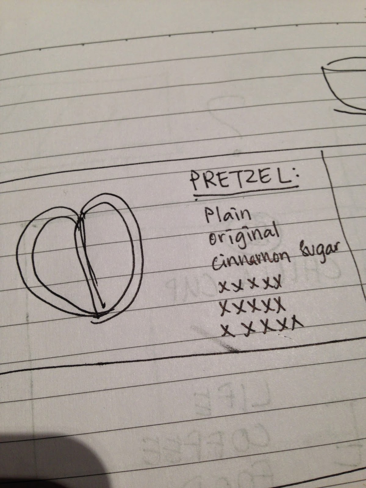
First the shape of our pretzel to begin with.
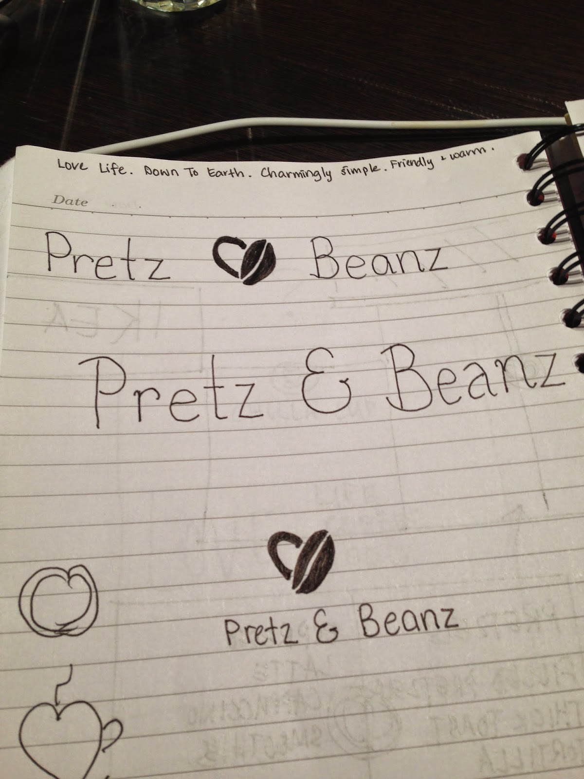
Then the shape of pretzel on the left and a coffee bean on the right.
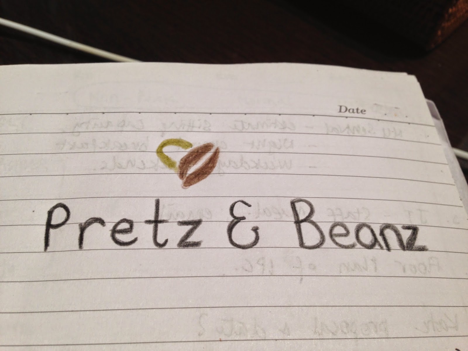

How about adding some colors? Huh huh...

After sharing with family, more modification and elements added to the original icon.
Now, pretzel on the left and coffee bean on the right in the shape of heart to symbolise LOVE - we love the pretzels and coffee we serve and we serve with our heart.
And it has a Chinese character of 人 (pronounce as "ren" which means human) - we serve people (human) with our love, our heart.
Now, it's so WOW to us :)
We move to the next stage of choosing fonts and there are tons to choose from online, following by colors. Although the entire process took us much time, but it was pretty interesting and exciting!
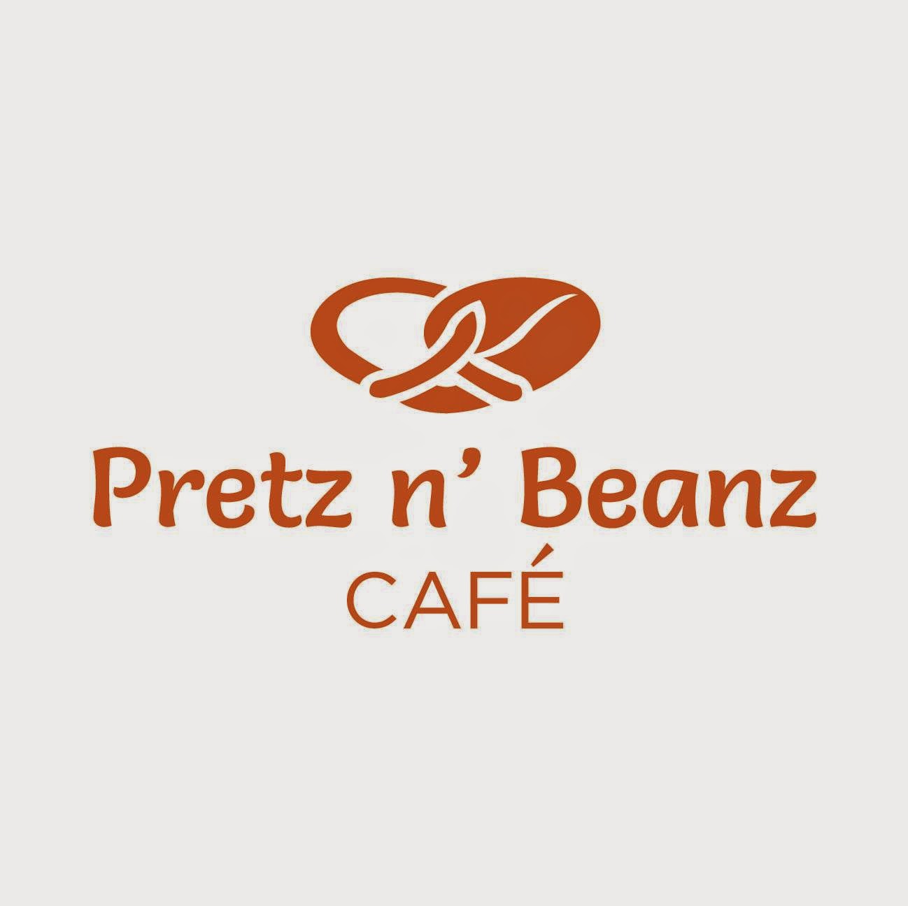
And the final product...
.jpg)
This may not be the best looking logo, but it is definitely one which we are so proud of! (*wink)
No comments:
Post a Comment